
- Year
- 2026
- Timeline
- 6 weeks
- Category
- Food & Drink
- Service
- Identity, Packaging
Goal
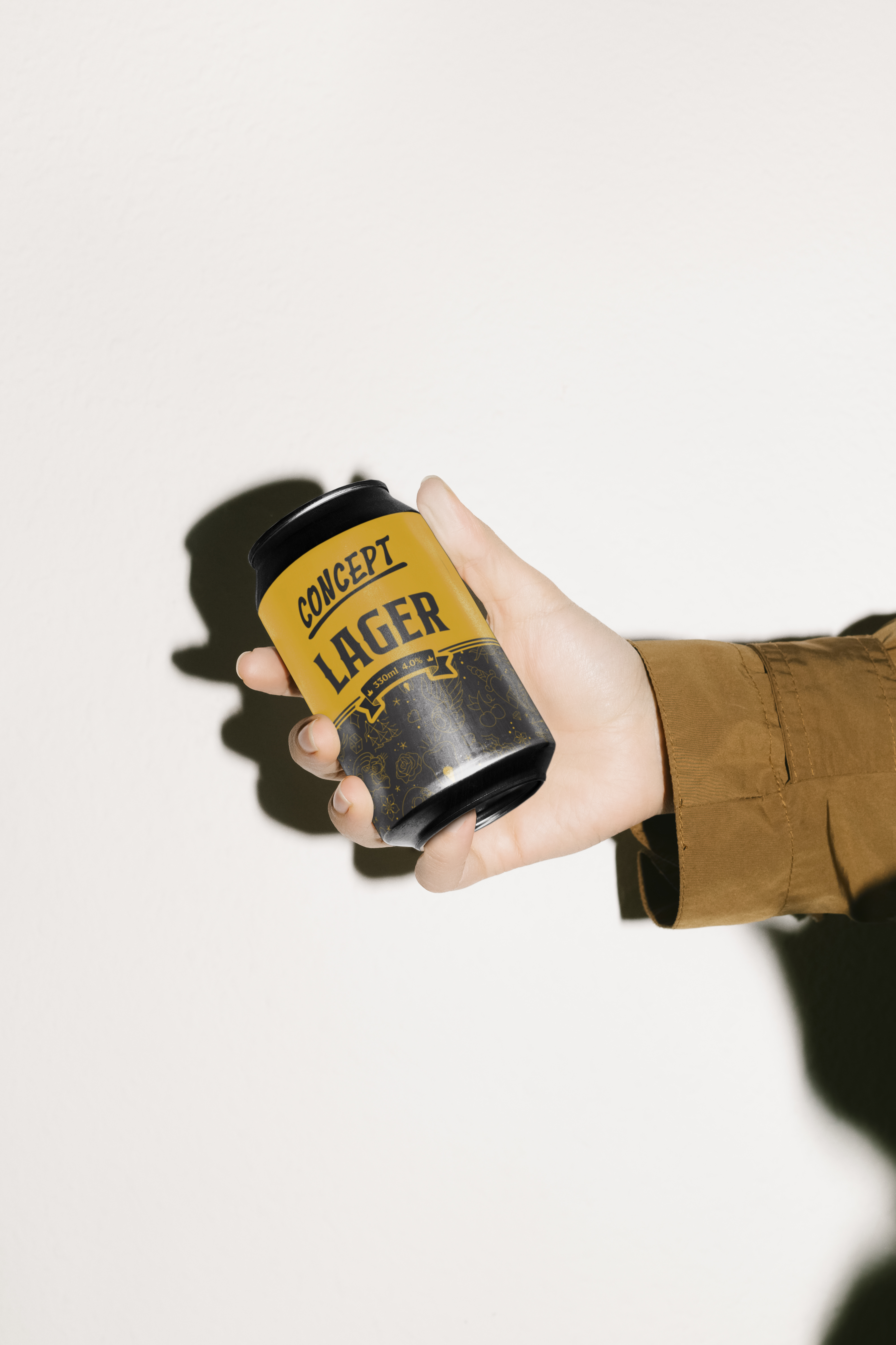
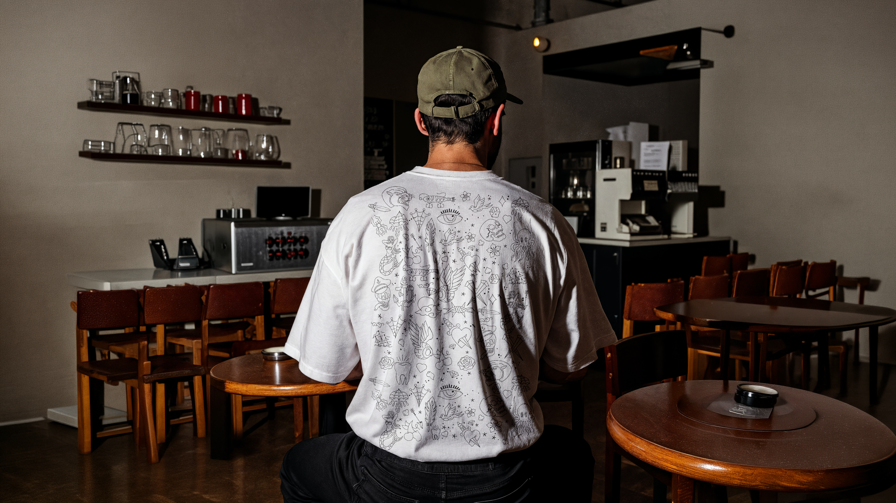
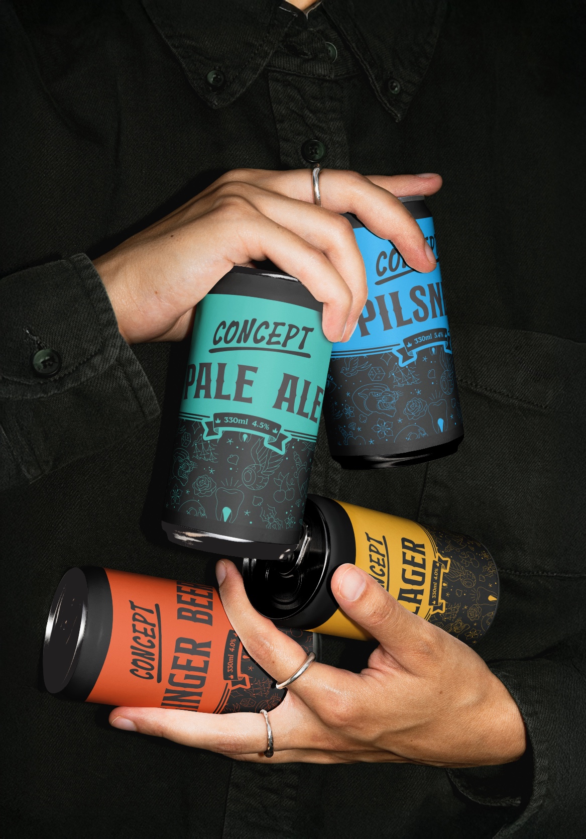
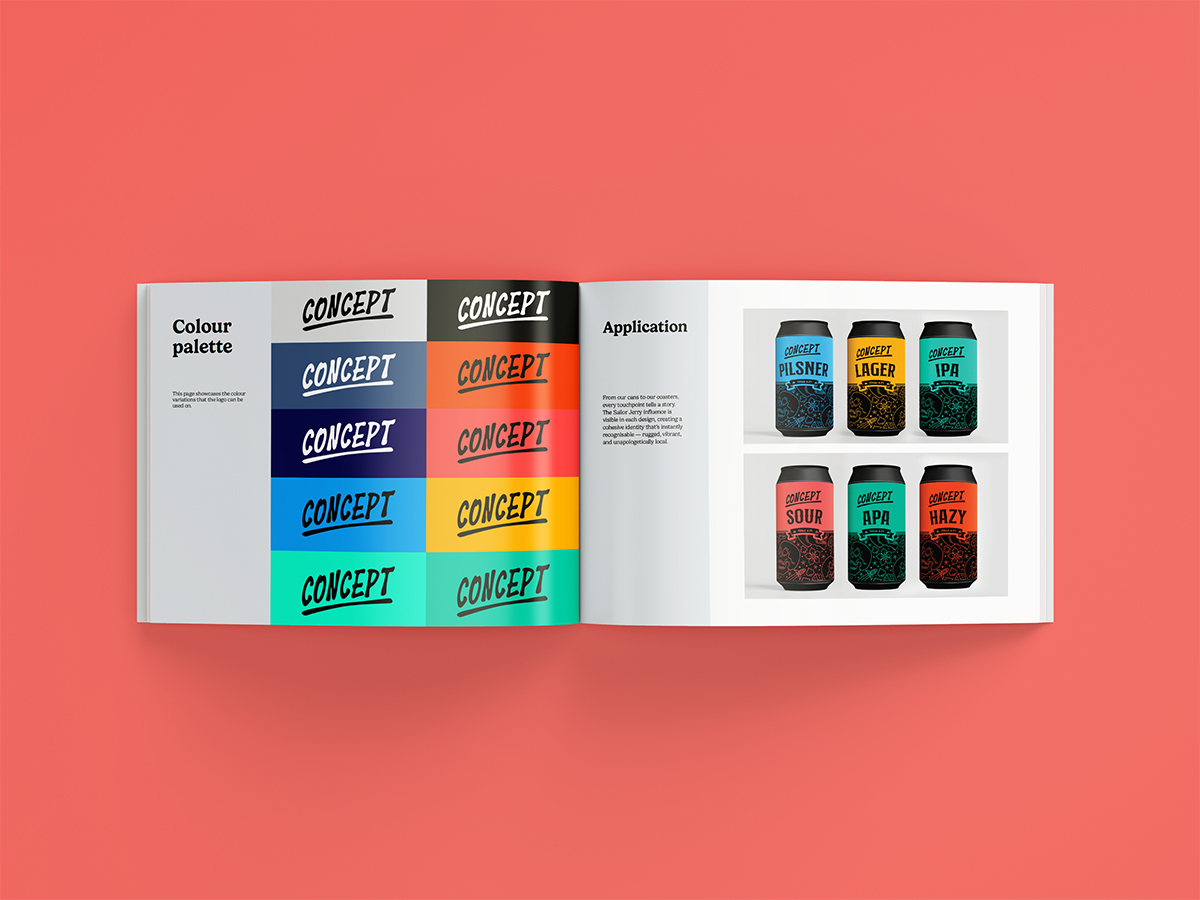
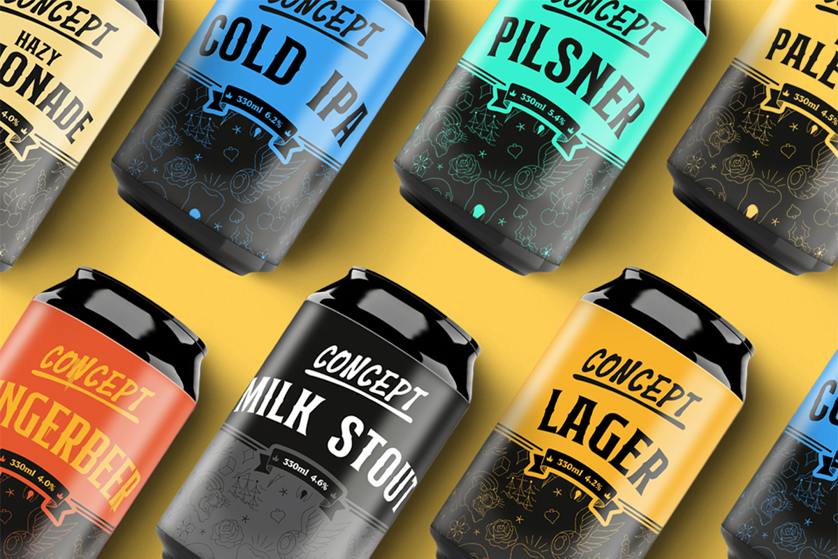
Concept made small-batch, experimental beer, but the old identity looked like it was trying to blend in. Every release was a new idea, and the brand had no way to show that. We needed a system as restless as the brewing: something that could take a new recipe every few weeks and still read as Concept from across the bar.
Result
Concept now looks like the people who drink it: inked, opinionated, and slightly too into the details. The identity borrows from tattoo flash, with heavy linework, bold fills and a confident hand. Every can could be a sheet pinned to a studio wall. It’s loud on purpose, but it’s never chaotic. That matters, because the craft beer fridge is a mess. Every brewery is shouting, and nothing hangs together. Concept’s range holds a single voice across every release. A shared structure, a tight palette and one consistent illustrative hand keep each can individual without losing the family. Put them side by side and they read as a collection, not a lucky dip.
- Year
- 2025
- Timeline
- 4 weeks
- Category
- Government
- Service
- Brand identity
Goal
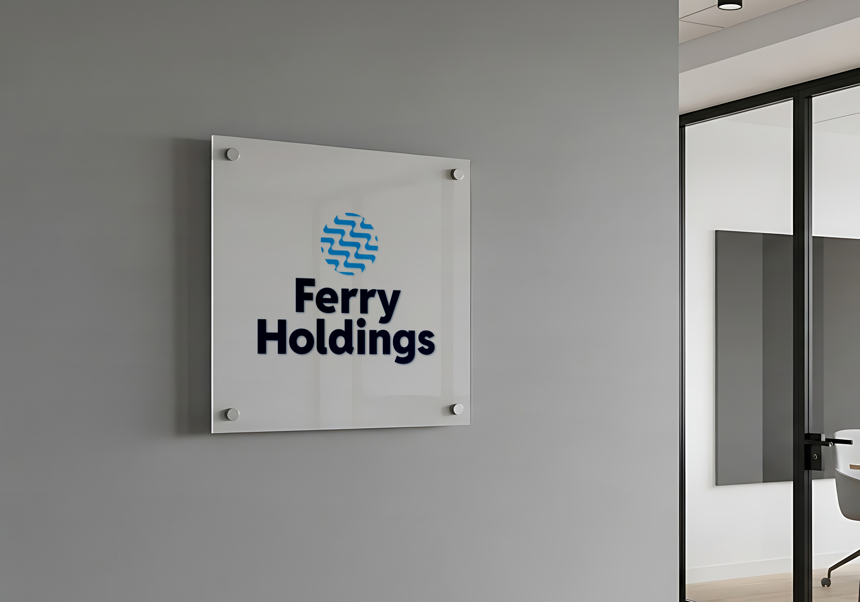
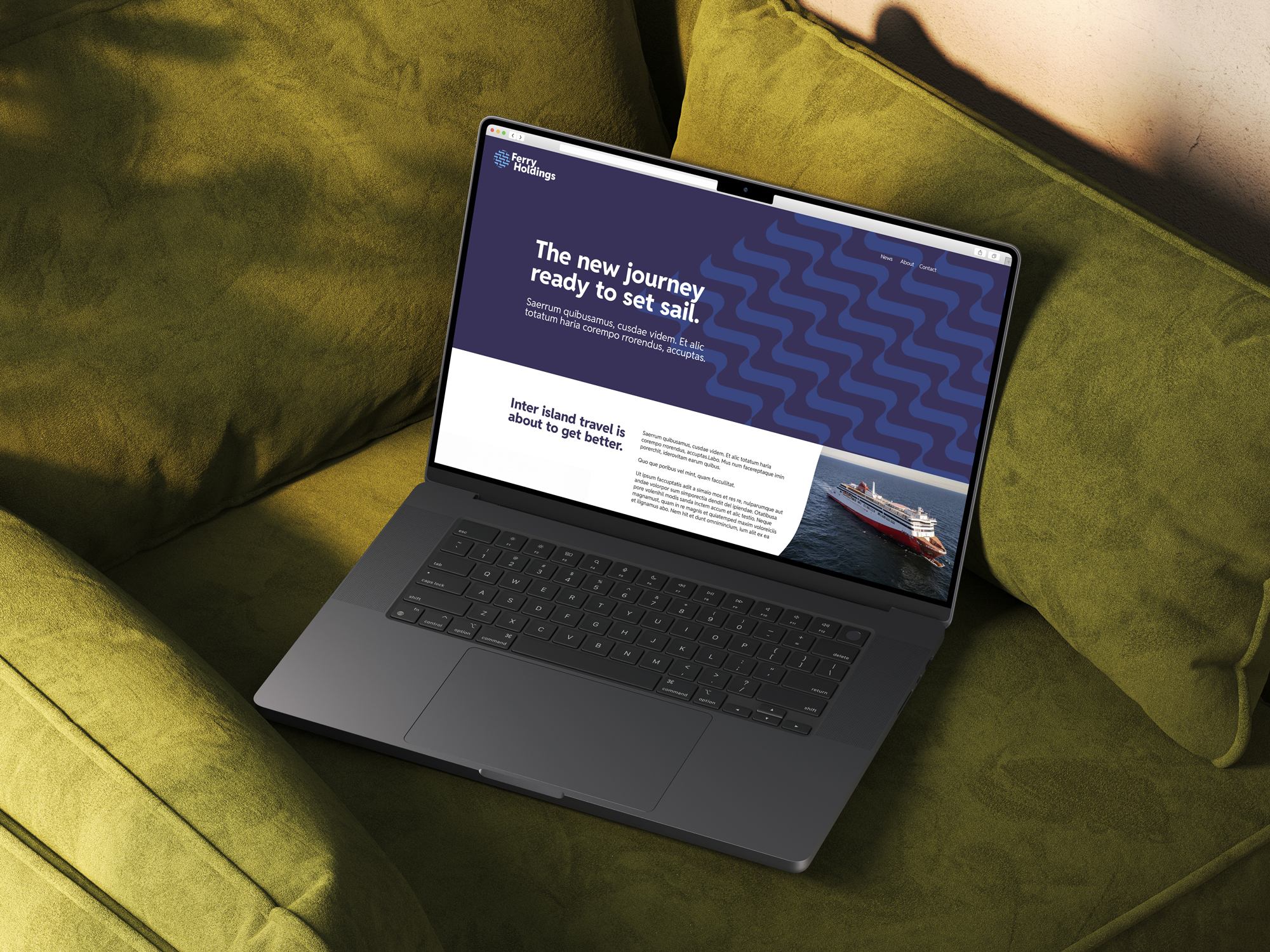
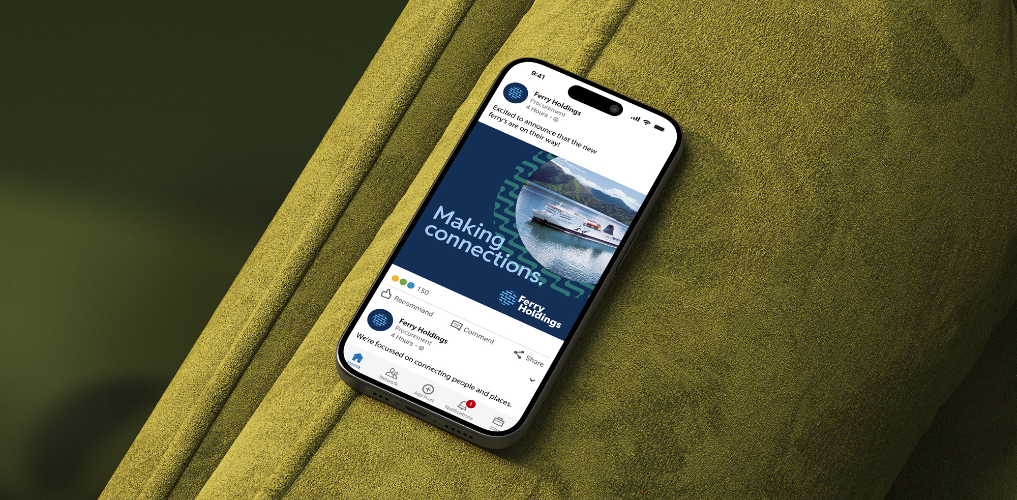
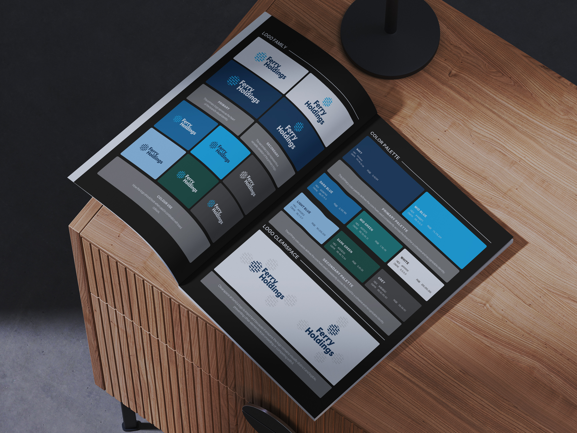
Ferry Holdings was a new business with no history to lean on, and its work would put it in front of government and the nation. In that world, standing out can count against you. The brief was to build an identity from scratch that looked like it already belonged in the room: credible on day one, comfortable next to a ministry letterhead, and serious enough to be trusted with public work.
Result
The brand speaks fluent government. A restrained palette, a clean and highly legible typeface, and a disciplined grid give it the quiet authority of an established institution. Nothing is decorative for its own sake. Every element earns its place, the same way it would in a public-sector document. It isn’t anonymous, though. A considered mark and careful typographic detail give Ferry its own character within those conventions. The result is a young company that reads as steady and dependable, and it fits into a tender submission or a briefing pack as if it had always been there.
- Year
- 2026
- Timeline
- 8 weeks
- Category
- Education
- Service
- Identity rebrand
Goal
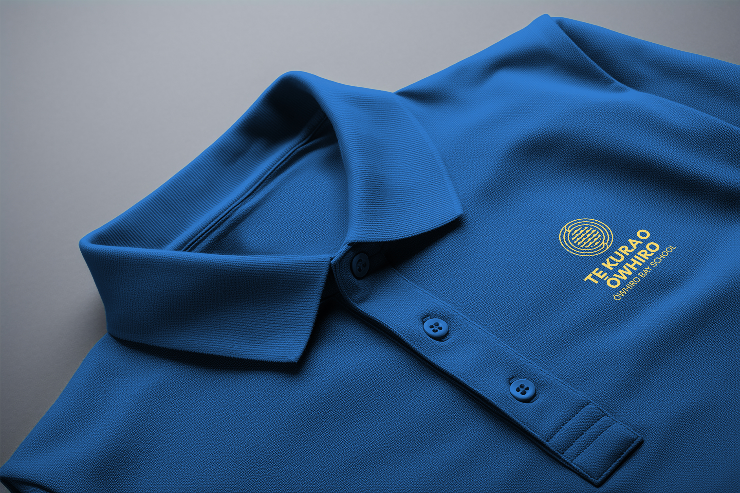
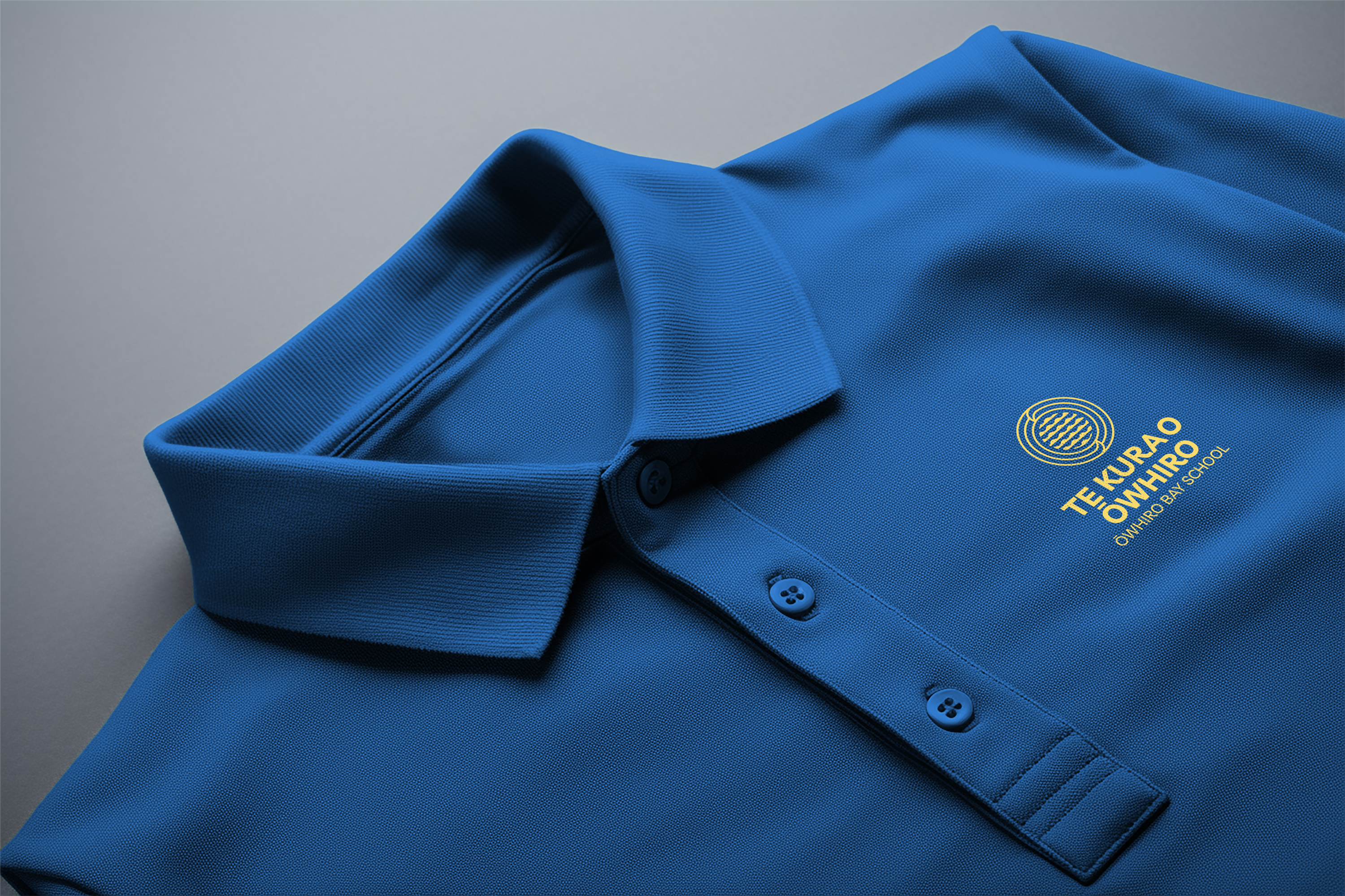
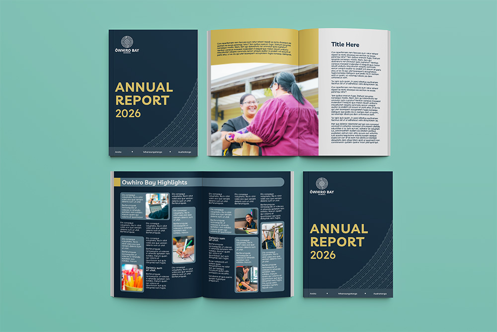
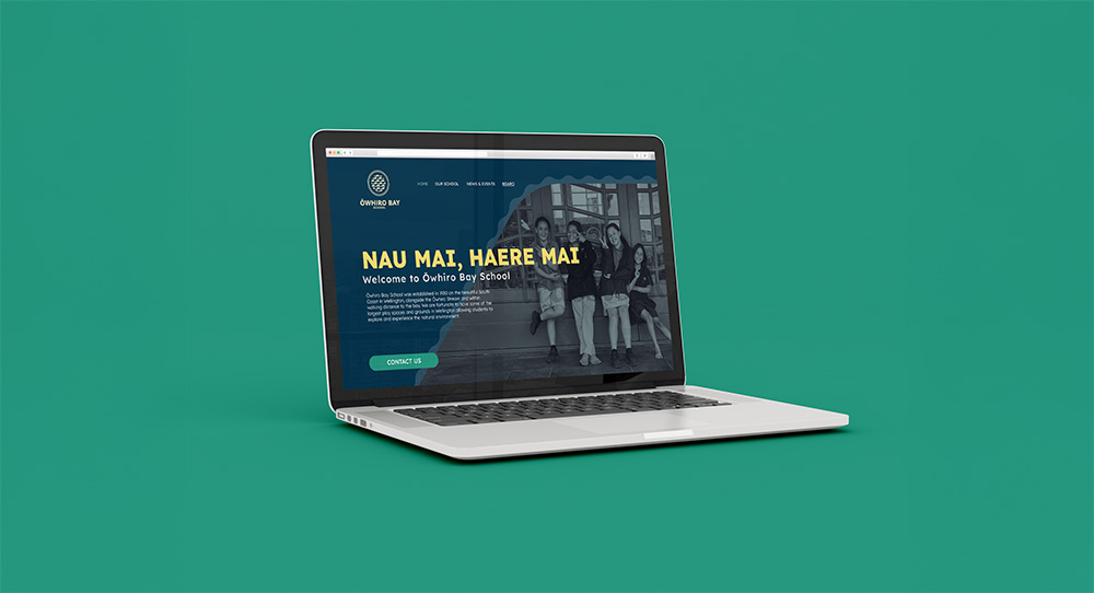
Ōwhiro Bay School had an identity that belonged to another era. The school had moved on and so had the country around it, but the brand hadn’t kept pace. The brief was to bring it into a contemporary Aotearoa: fresh enough to feel current for today’s whānau and tamariki, and grounded enough to still feel like home.
Result
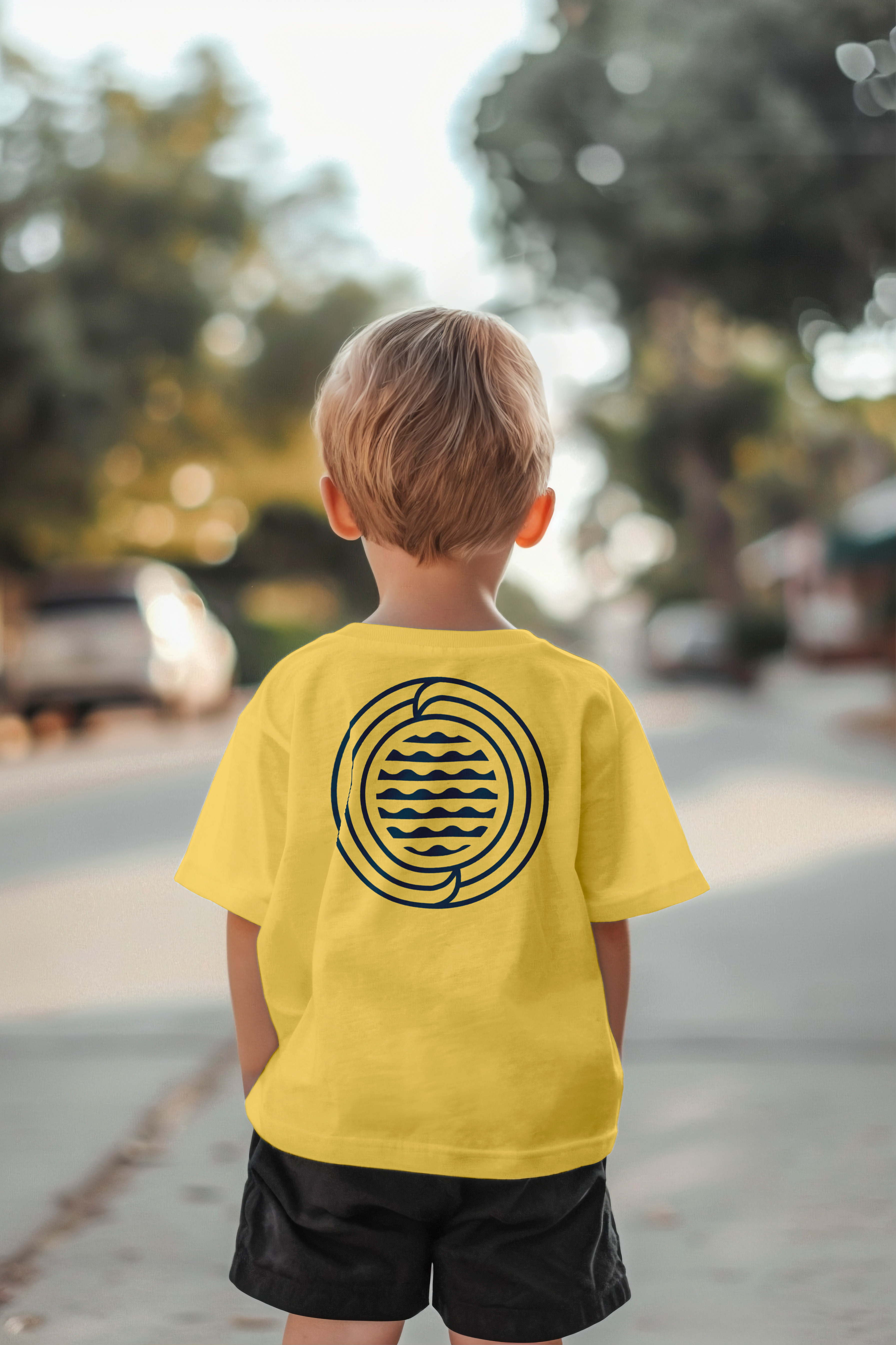
The new brand takes its cues from the place itself. Ōwhiro Bay sits on Wellington’s wild south coast, and the identity draws from that: the rugged rocks, the swell rolling in off the strait, and the kelp moving under the surface. The colour palette comes straight from the shoreline, and the mark’s shapes echo the bay’s natural forms rather than borrowing generic school symbols. The result is modern without being cold. It’s clean, confident and simple to use across everything from uniforms to newsletters. It also carries a strong sense of where it comes from, so it reads as a school that knows exactly where it stands.

- Year
- 2021-2023
- Timeline
- 2.5 years
- Category
- Automotive
- Service
- Design, Events, Campaigns
Goal
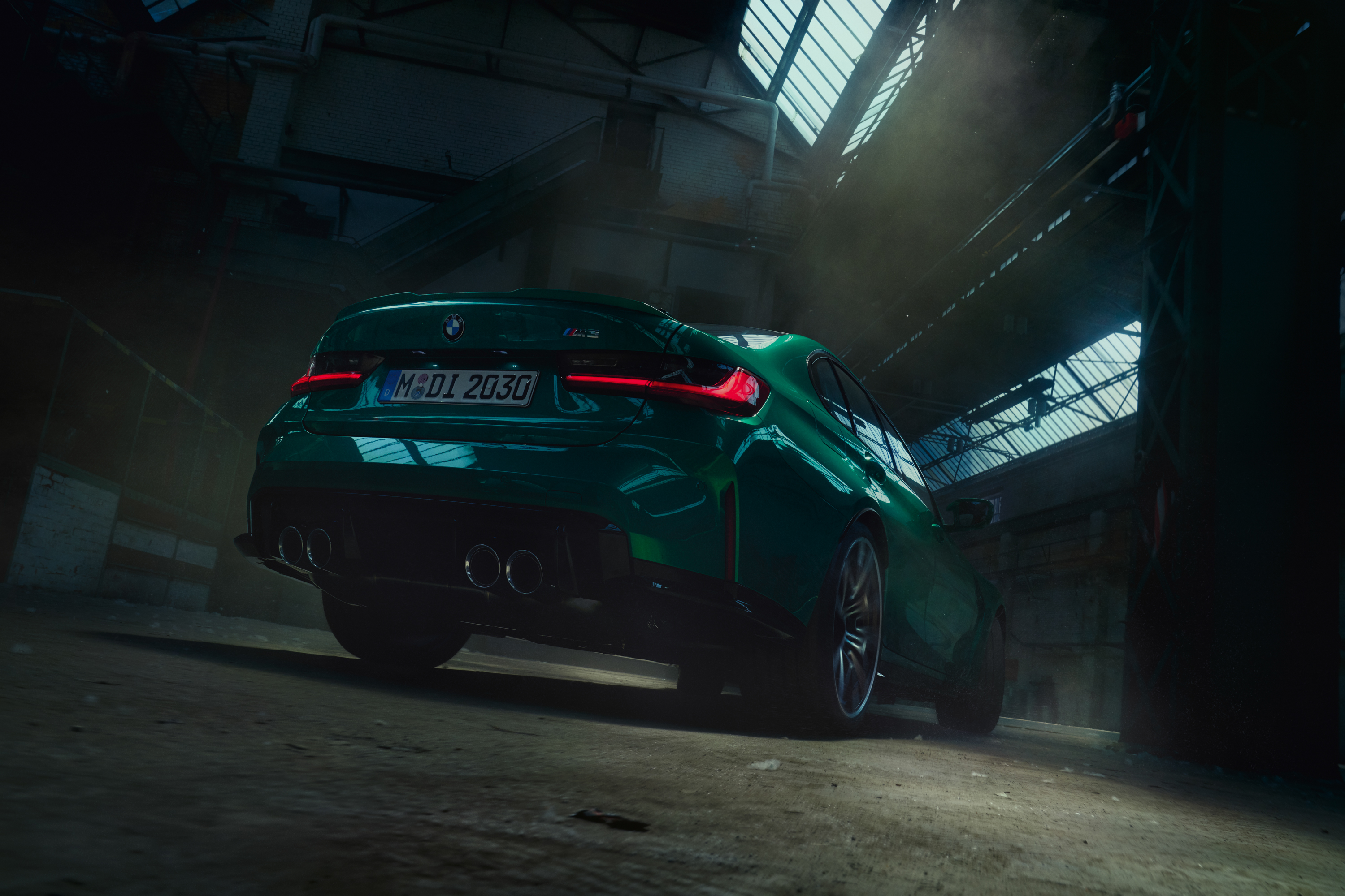
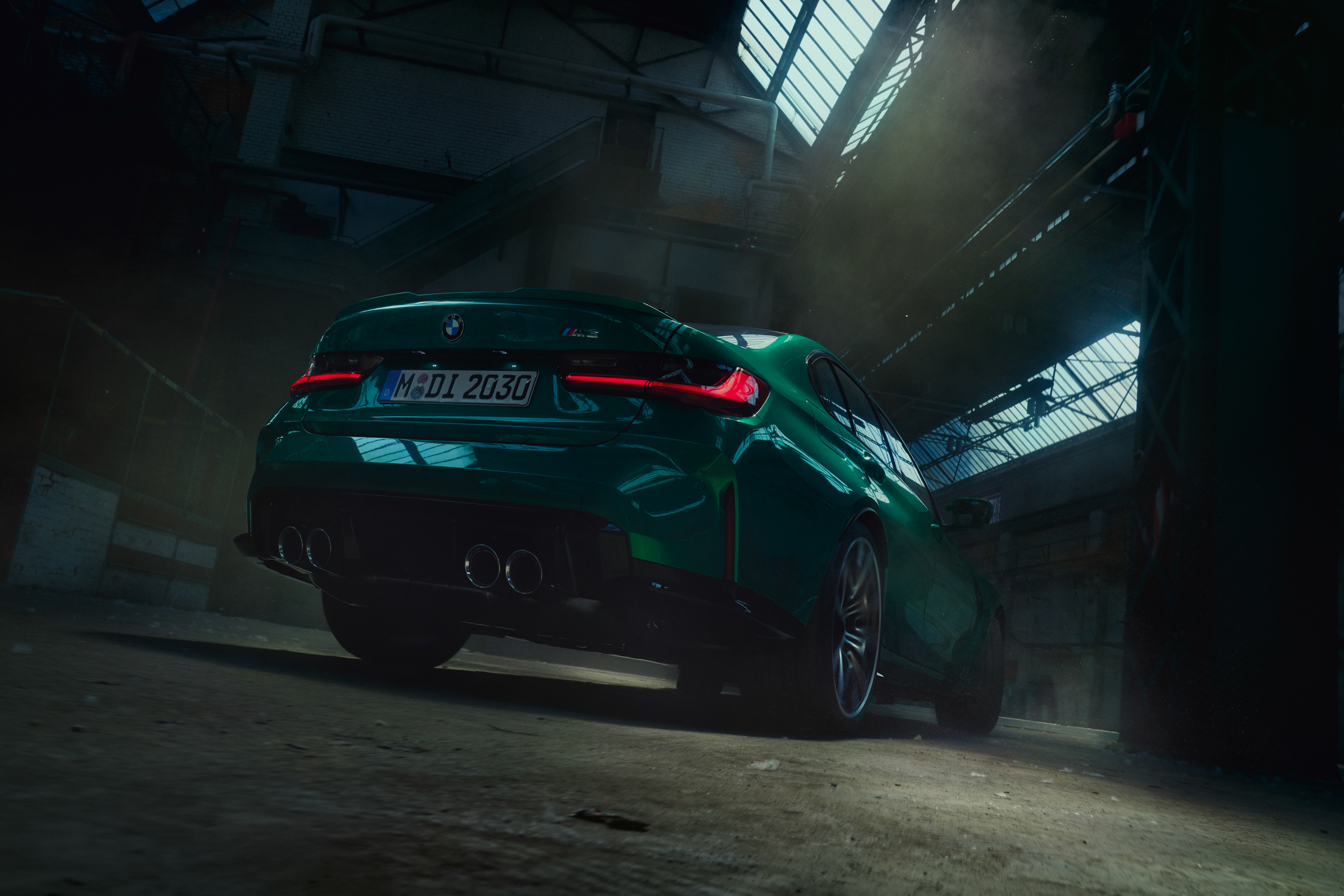
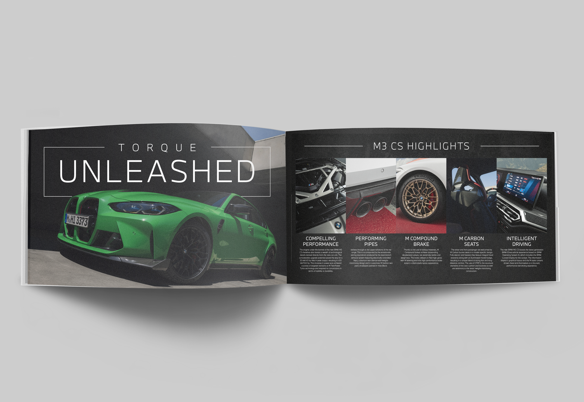
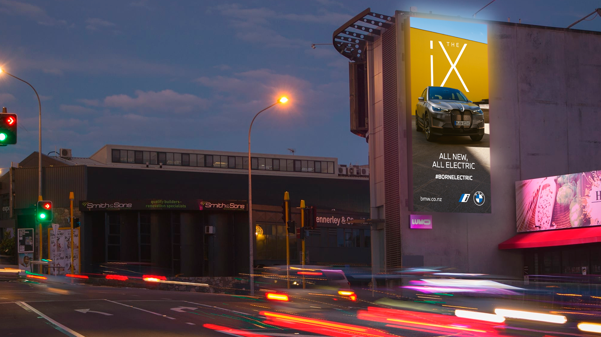
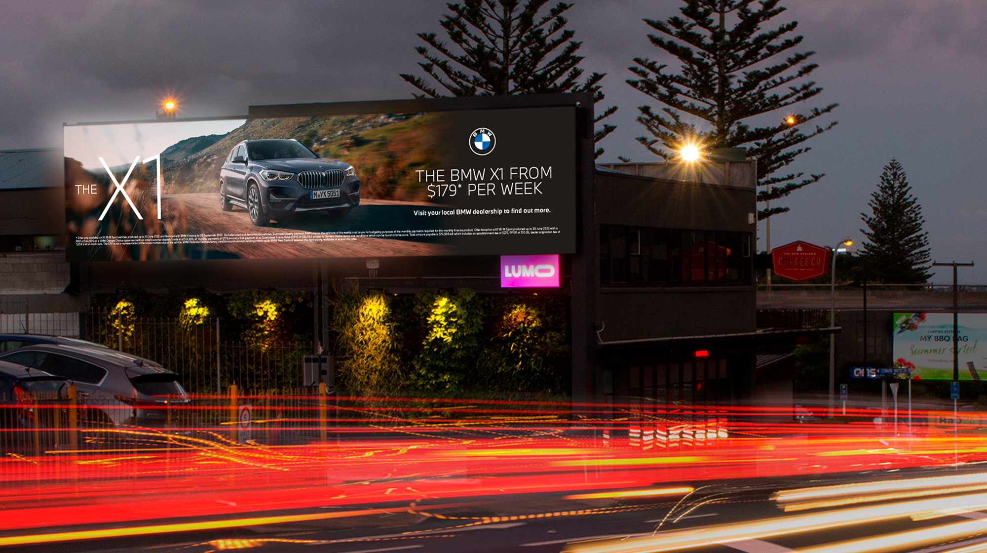
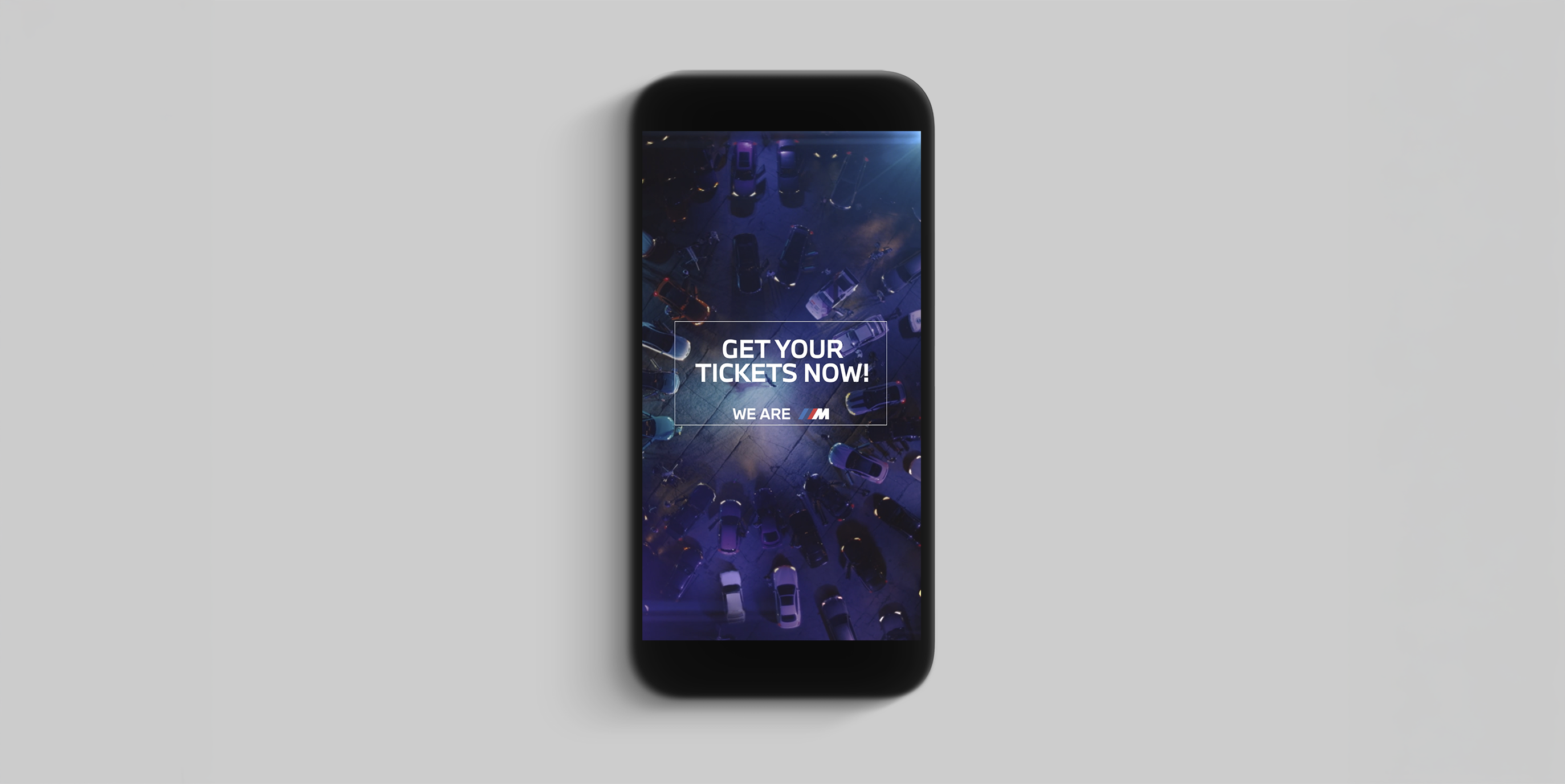
Working in-house at BMW New Zealand, my brief was simple to say and harder to do: lift the standard of everything we put out. BMW is one of the most carefully guarded brands in the world, and the local work needed to live up to it. That meant raising the craft on day-to-day output, from dealer campaigns and social posts to event collateral and print, so that it felt as considered as the cars.
Result
The work got sharper and more consistent across every channel. I tightened how the global guidelines were applied locally, bringing more discipline to layout, typography and image selection, and more confidence in how the brand used space. The work got quieter where it needed to and bolder where it counted.
- Year
- 2026
- Timeline
- 5 weeks
- Category
- Tourism & heritage
- Service
- Identity
Goal
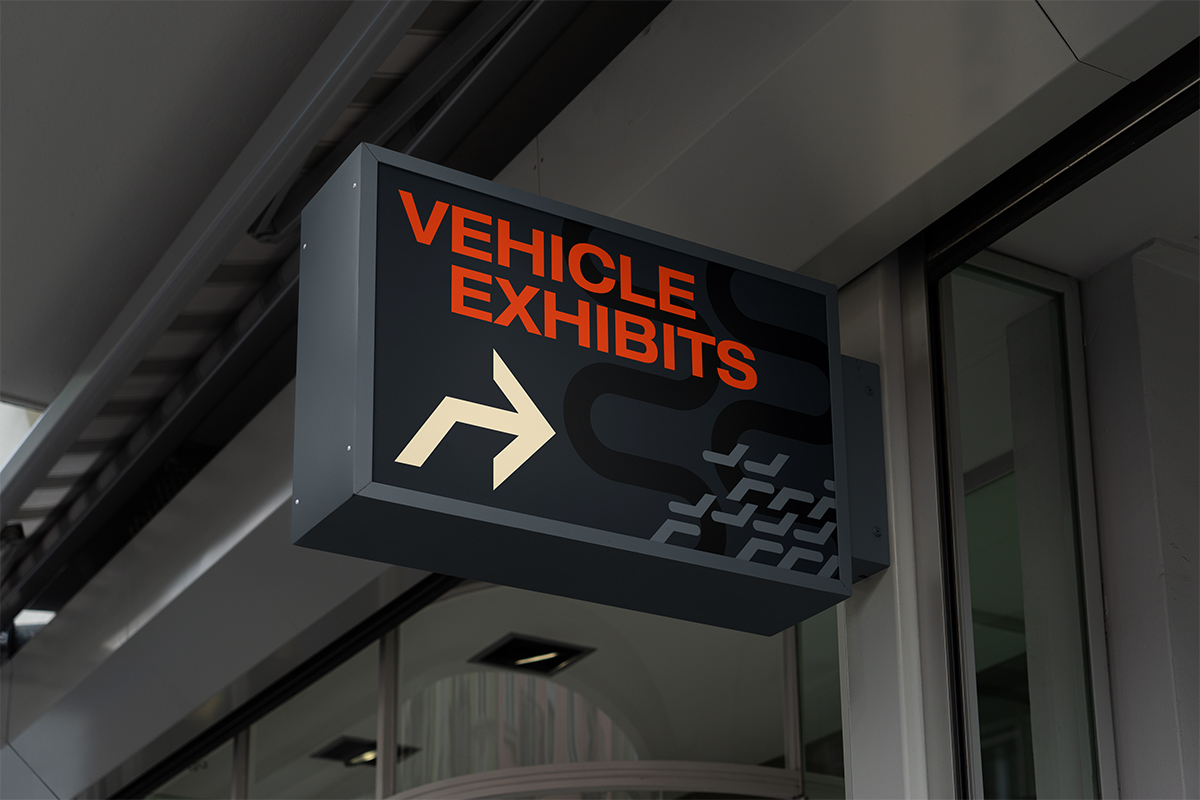
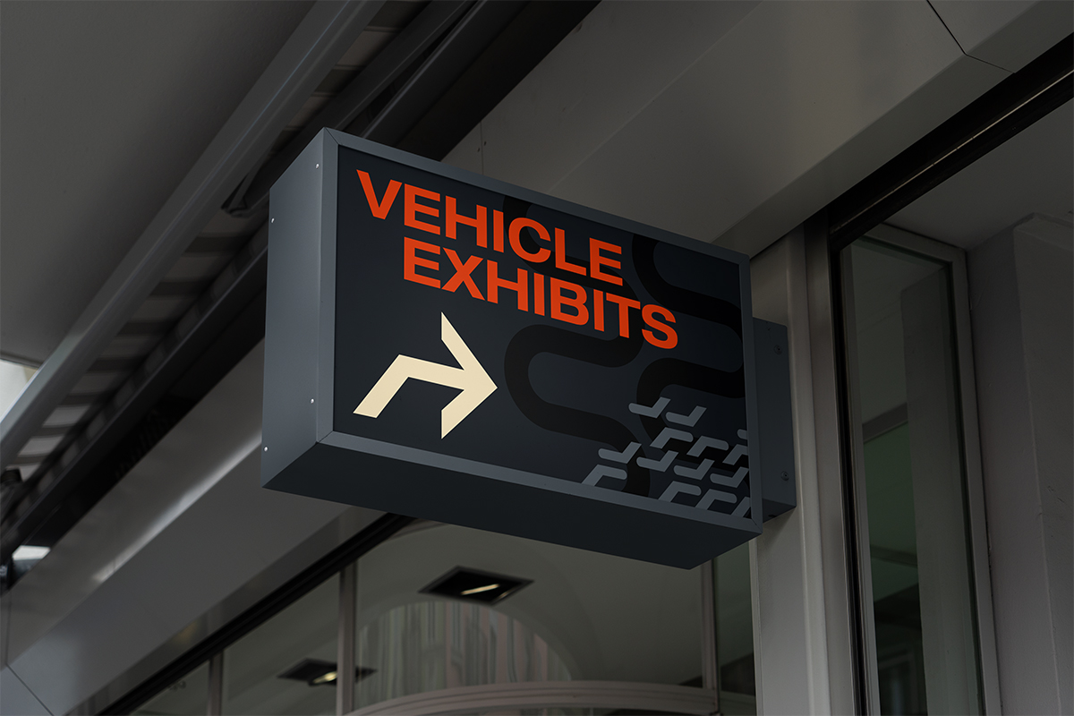
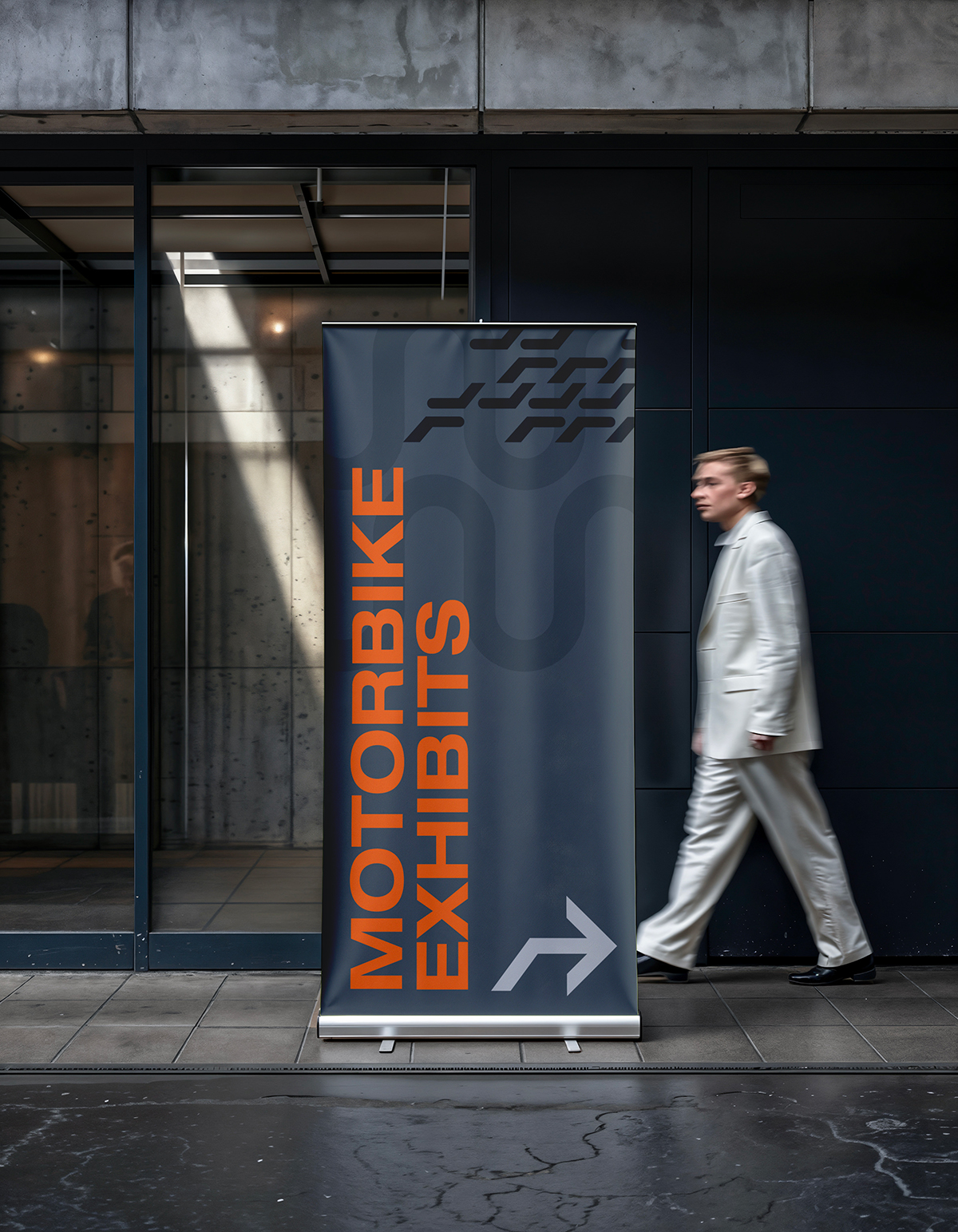
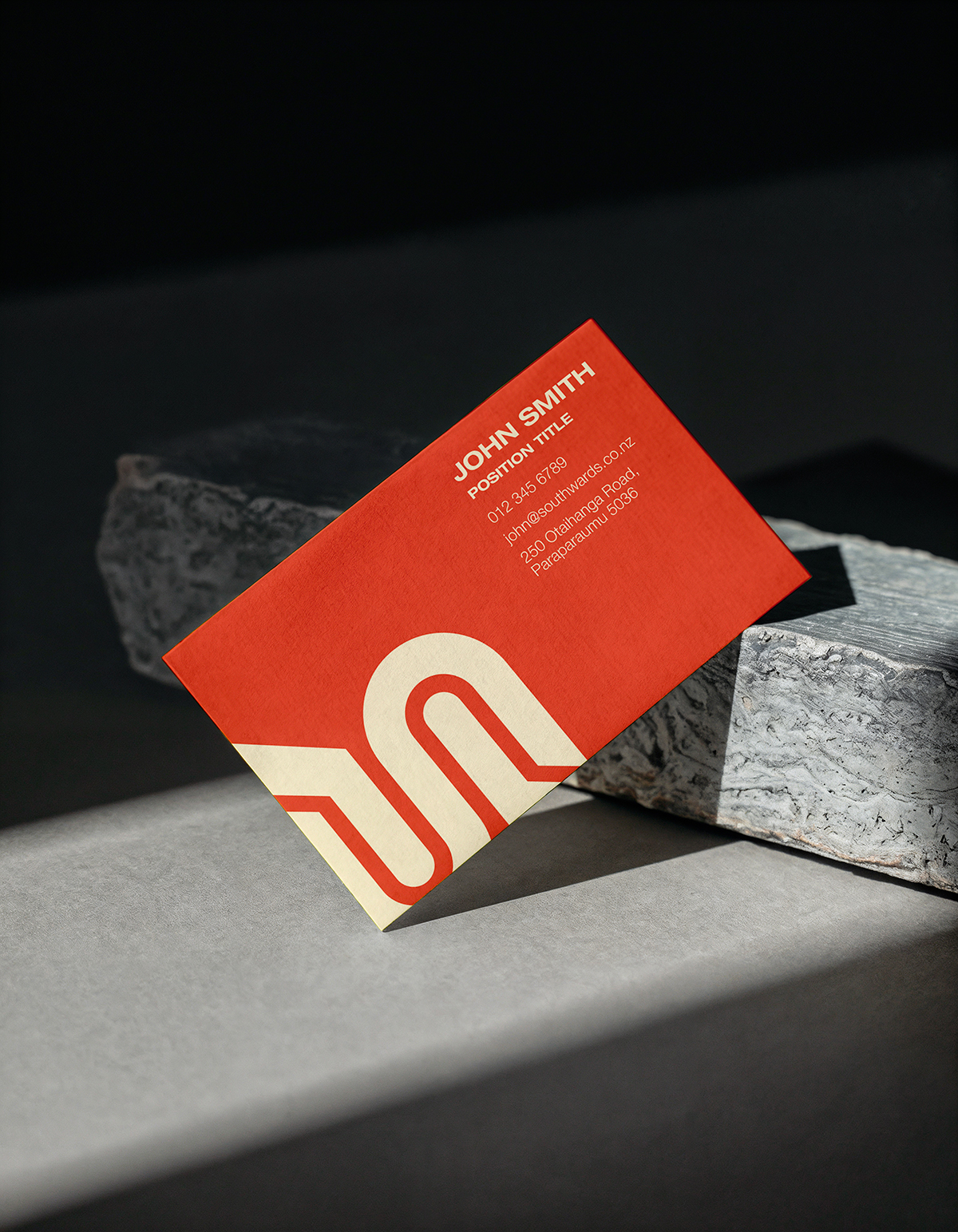
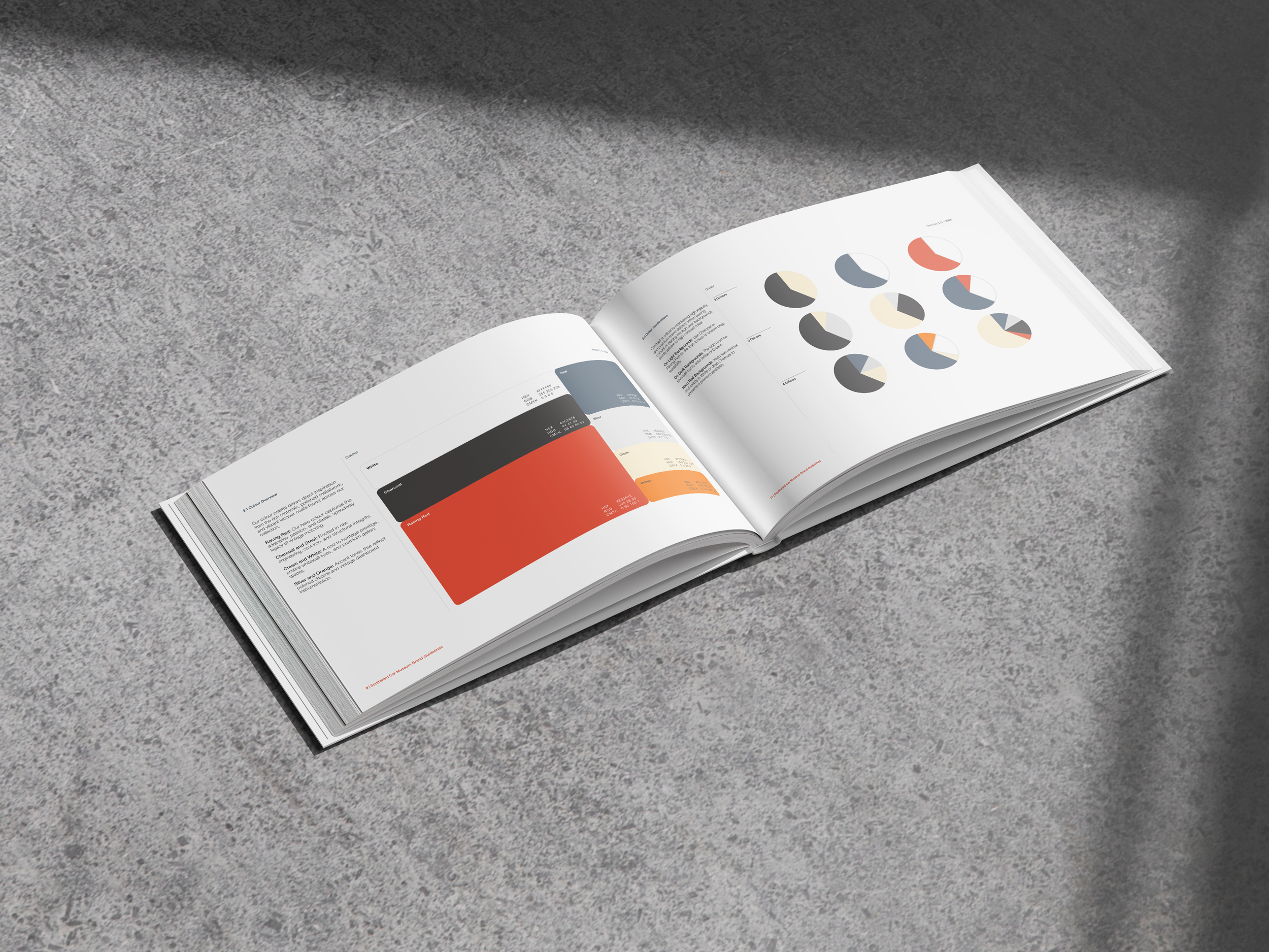
Southward Car Museum holds one of the most significant vehicle collections in the Southern Hemisphere, but its brand wasn’t doing justice to what was inside. The identity felt dated and undersold the experience. The challenge was to make the museum feel like a destination again. It needed to draw in new audiences, from families to design lovers, without losing the enthusiasts and the heritage that Sir Len Southward built it on.
Result
The rebrand treats the collection like the icons they are. The identity borrows from the golden age of motoring, with confident type, a sense of speed and the polish of a well-kept chrome finish. It’s delivered with a contemporary restraint that keeps it from tipping into nostalgia. The result is a brand with presence. It respects the history but isn’t stuck in it, and it works across signage, wayfinding, digital and merchandise. Southward now looks like what it is: a world-class collection worth the drive up the coast.
About
- Location
- Wellington
- Experience
- 20 years
Work experience
Paradigm (formerly Obvious)
Associate Creative DirectorThis role involves managing relationships with both internal and external stakeholders to ensure effective communication and alignment. The position requires expertise in art direction, design, and concept development, with a focus on delivering creative and multimedia solutions across various platforms ranging from annual reports, digital products, out of home advertising and brand design. In this role, I manage three intermediates and one junior designer along with a team of freelancers of varying experience.
Self employed
FreelancerDuring my time as a self employed freelancer I worked on a vast range of projects for international and national clients including: BMW, Z Energy, State Insurance, Auckland Council, and SBS Australia. Across these clients I worked on projects including annual reports, internal and external advertising, various print applications and various digital products.
PwC
Senior Design Lead (Contractor)As a key member of PwC’s in-house design team, I provided art direction, design, and concept development to create innovative visual solutions aligned with the brand’s objectives. My role also involved videography, editing, and animation, delivering dynamic multimedia content. I contributed to the development and evolution of branding strategies and maintained effective stakeholder management to ensure alignment with business goals and client expectations.
Marketplace Media
Art DirectorI acted as the primary client liaison for advertising briefs, translating client needs into innovative conceptual advertising campaigns. Additionally, I provided art direction for various publishing titles, web and social media advertising, ensuring cohesive integration across digital platforms. My responsibilities also included copywriting and contributing to the development of new project ideas and strategies to drive creative growth and client success. During this time, I was the lead with two other designers in my team.
Fairfax Media
Senior Graphic Designer & Art DirectorA senior leader in a team of six, responsible for the art direction and design for Unlimited and Sky Sport the Magazine. I was tasked with creating compelling visual concepts and overseeing the execution of design elements that aligned with the brand’s identity. Additionally, I spearheaded the development of new project concepts, driving creative innovation to support the brand’s ongoing growth and engagement.
SCG
Intermediate DesignerIn this role, I led the conceptualization of advertising campaigns for various clients, translating their objectives into creative, impactful visuals. My responsibilities included overseeing the art direction and design of multiple publishing titles, ensuring each project delivered a cohesive and engaging experience that resonated with target audiences while aligning with brand guidelines.
3Media Group
Graphic DesignerIn this role, I provided art direction for magazine design, overseeing the visual aesthetic and layout to ensure a compelling and cohesive publication. I collaborated with editors and content teams to create engaging, on-brand designs that enhanced the reader experience while maintaining editorial consistency and visual appeal throughout each issue.
Marketplace Press
Graphic DesignerIn this role, I was responsible for both magazine design and advertisement creative, ensuring visually compelling and cohesive layouts that aligned with the respective client’s identity. I developed innovative design solutions for editorial content, as well as crafted engaging advertisements that captured attention and effectively communicated key messages.